![]()
I've been the webmaster for a number of non-profit groups, including the Unitarian Universalist Fellowship of the Mendocino Coast. The lay leader for the UUF of the Mendocino Coast writes an essay on spirituality every month. In May 2011 he wrote Things You'll Never See. Here's the teaser:
When I was building my house, my builder told me something that's stayed with me for 22 years now: "There are things that you'll never see that are in your house."
Things like more nails than required by the building code; stronger bracing where he thought it would help, should a bad earthquake hit; and the smallest possible holes in the wall studs for the wires, so as not to compromise the stud's strength, even though it made feeding the wires through them rather difficult.
His essay struck a chord with me. There are things you'll never see, or may not have noticed, inside my web sites. They make it better, even though it took me a little more time to do them. Here is a list, in no particular order:
Colors: The text, background and heading are the same color on every page. All of the text links are blue and underlined. With very rare exception (The examples in "Warnings", below) no other text is blue or underlined. You can tell what is a link at a glance.
Warnings: I give a friendly warning if a link goes to a page
bigger than 100 KB or to a PDF file:
Read more (250 KB)
Fill out the form (PDF, 450 KB)
Breadcrumbs: For instance, at the top of this page:
Home >
Homilies >
Adventures of a UU Web Master > Inside
That may tell visitors how they got here. It may not; 80% of our visitors find
a page through a search engine, instead of clicking down from the home page.
It does tell them where they are, that I have a collection of homilies,
and one of those sermons is about being a web master.
Navigation bar: On every page it makes sense to have it. The home page and some others (this one, for instance) don't have it. Breadcrumbs and a navigation bar may sound like a belt and suspenders, but some people like one, some the other, and they are slightly different.
Accents: There is some magic you can do that puts the accent on words like café. I use it. If you've ever seen a web page or an e-mail message with odd symbols - the Euro currency sign, for instance - where an accented letter, apostrophe or ampersand should be, you've seen an example of the problems computers sometimes have with special characters.
|
|
Valid HTML I validate my HTML with the w3.org Validator. w3.org is an international body that sets standards for HTML, the language I write in. Some browsers will accept non-standard HTML, which then looks funny in other browsers. My sites look about the same with any browser. |
Name, Address and telephone at the bottom of every page. Visitors don't have to go to the home page to find out where we are, nor do they have to go to "Contacts" if they want to send an e-mail.
Dates: All of them have the year as well as the month and day. The year assures visitors the site is current. Most have the day of the week, too. (Sermon blurbs on "Sunday Services" don't. Why be redundant?)
Text Size: gets larger when you click on
View > Text Size > Larger
and smaller when you click on
View > Text Size > Smaller
Some web masters use a fixed text size. I consider them to be arrogant clotpolls.

|
Pictures: You may have seen a web page with a small picture
that took a long time to load. That is usually because the web master
has put a 5,000 x 3,000 picture on the site, but set the size to 500 x 300.
You are waiting while your browser shrinks the picture 99%. I use a photo
editor to make each picture the size it is going to be on the page.
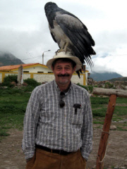
The one on the left is 180x240, for instance. I use what are called "Alt" and "Title" tags on each picture. The Google robot reads them, to index them for its image search. The magic boxes blind people use that either read a page aloud or translate it into Braille also use them. If you hover your mouse over the picture, you can read it yourself. |
Page Titles: Plain as a mud fence, but clear. A UU site in San Diego used to have a page titled "Links". It didn't have links on it; it described a social networking program they had called "Links".
Title Tags: At the very top of the page, above even "File Edit View ..." and the URL, is the page title. It shows up when you minimize the page and hover over the icon on your task bar. My pages all have meaningful titles.
Line breaks: If you click on "View > Source" you can read the HTML behind the page easily. With very rare exception, none of the lines are more than 72 characters long. This is partly for my own ease, when I edit, and partly a habit left over from punching 80-character IBM cards in my youth.
Description meta-tags: This is more of a magic paragraph than a
magic word. Google likes them to be 120 - 150 characters. It (and other
search engines) use the page descriptions to make up the default "Google
blurb" for a page. If you use the word "site" and a colon in Google,
you can see them. Try it:
Google site:www.tedpack.org.
![]()