Home >
Web Design > Church
Suggestions for Church Web Sites

I've been the Web Master for various churches since 1999. Every once in a
while a young person just starting out will ask me "Ted, can you sit
down for about fifteen minutes and tell me everything you know?"
Here is everything I've learned. There are 9 sections on this page and
some other pages:
Disclaimer: I'm not the world's best web designer. There are
sites which break many of my rules and are stunning.
See a list. Again, this is a list for
new, inexperienced, volunteer web masters.
The first thing to do is decide how complex a web site your
volunteer web master(s) will be willing to support.
There are several levels of church web sites. The lowest is the
Internet equivalent of a quarter-page advertisement in the yellow
pages. It is just one page with:
- Church's name, street address, city, state and phone number.
- An E-mail address for people who have questions.
- A location map, driving directions or a link to MapQuest.
- A schedule of services. ("Sunday school at 9:00, Worship at 10:00,
Bible Study every Wednesday evening at 7:30").
- A short statement of beliefs to let people know if you are liberal,
conservative, orthodox, reform, Pentecostal or fundamentalist.
- Minister's name.
- Name of the building, if your church rents space in a building that
doesn't have your name on it.
- Post office box, if you have one.
- (Optional) a picture of your building, your minister or both.
Once you set it up, you don't have to change anything unless you
move, change ministers, get a new phone number or change your schedule.
Not very exciting, but it is a web site, and people who turn to the
Internet before they turn to the telephone book will find you.
The Level Two Site
Level two is a three to five page site, still static. To the
original you might add:
- A longer statement of beliefs, to let people know why you are liberal,
conservative, orthodox, reform, Pentecostal or fundamentalist.
- A short biography of your minister. Unless you are the only church of
your denomination within 50 miles, your minister will be the main reason
people come to or avoid your church.
- A full page for the map, with driving instructions in words for
people who don't like to read maps. You might use a link to MapQuest.com
here with the link parameters set for your building. I find their maps have
too much detail, so I do my own, but it is faster to let them do the work.
- A list of amenities, rules, fees and a contact telephone number, if you rent
your facility to non-members for weddings, funerals or other gatherings. Some
liberal churches in conservative areas make a hefty amount every year from space
rentals because they allow champagne at wedding receptions.
- A list of ongoing activities - Bible Study every Wednesday, Women's
Prayer Group every Thursday, Teen social gathering the last Friday of
every month, and so on. Things that you do on a regular basis.
- An FAQ Page for first-time visitors.
(More on that later.)
Note that you still don't have to change things very often. Put the church name,
address, phone number and an E-mail address on every page.
Level Three and beyond
At level three you can expand the pages above into sections and add
pages for news, calendar and sermon topics, which all have to be updated
on a regular basis. These three make your web site timely and more useful.
They also require someone update the web site every time the newsletter
comes out. There are other pages or sections you may or may not want to
add; more on that later, too.
At levels beyond three you can have:
- On-line newsletters.
- Streaming audio (or video) sermons for shut-ins.
- Thought-provoking "Musings from the Minister", updated daily or
weekly.
- Password-protected areas with telephone and E-mail directories.
- Chat rooms.
- Discussion lists.
- Board meeting minutes.
And much, much more. If you are considering a level four, five or six
site, you know more than I do about web design and it would be presumptuous
of me to give you advice.
Matching Your Site to Your Volunteers
Note again that I ranked the sites by ease of maintenance. Here is a
dirty little secret in church web site circles: creating the site is
fun. Maintaining it is work. Coming up with the initial design is fun.
Seeing your first hundred visits is fun. Finding yourself for the first
time in Google is fun. Seeing your listing in the Yahoo categories is
fun. Updating the calendar and sermon topics for the fifth, fifteenth
or hundred and fifth time is work.
This means you should choose your web wizard carefully. Letting a
16-years old whose IQ is greater than his body weight knock something
together and throw it out on GeoCities is usually a mistake. He'll lose
interest when he goes off to MIT and people will eventually notice your
calendar page is two years out of date. If your congregation is big
enough, get three or four people who know what "FTP" stands for to
share the work.
If your congregation is small, like ours, but you have someone who
is intelligent, witty, devoted, faithful and devilishly handsome, have
him do it. If you don't have someone willing to update the site every
time your newsletter comes out, settle for a small, static site. You
wouldn't plant 500 trees in your church garden if you didn't have a
couple of foresters in your congregation. A small, simple site is better
than a complex one that is out of date.
Level one, two and three sites are outer-directed. They are for
people looking for a church. They are not particularly useful to your
members who show up every Sunday no matter what. They know where the church
is, when services start and they probably have the minister over for Sunday
supper once a month. If you are the only Lutheran church in a small town
full of people whose families have been Lutheran since 1610, you don't
really need a web site with a location map.
Implications of Google on Web Site Design
In the years BG (Before Google) most people looking for a church
on the Internet would do it by categories, through the denomination's
national web site, the Yahoo! entry for their town, or a community
directory. Today they are most likely to enter the name of their
denomination (or the word "church") and their town in a
search engine. We get 90% of our visitors from search engines.
Google is the most popular search engine on the planet, but these
hints apply to all search engines.
The fact most people will find you via a search engine has
implications for web design. First, not everyone will come in
through the front door, so to speak - your home page. Our church
site has about 100 pages. Only 20% of our visitors enter through
the home page. Visitors will need to know who you are. Second,
you'll need to mention the name of your town and denomination in
the body of your pages for the search engines that index sites by
content rather than keywords. You can satisfy both needs by putting
your church name, address and phone number on every page. I put
ours at the bottom. That way people can find it if they want to,
but they didn't have to scroll past it every time they go to a new
page.
If your church name doesn't include your denomination, add it to
your address:
Old Stone Church
(Lutheran, Massachusetts Synod)
1234 Elm Street
Springfield, Massachusetts 12345
(555) 765-4321
If your church isn't associated with a denomination, you'll want to
put that on every page instead:
New Brick Church
(Independent, Bible-based, Pentecostal)
4321 Elm Street . . .
Another implication - you should have a link to your home page on
every interior page. A navigation bar with the main sub-sections is
even better. Your visitors are not always going to be able to use
the "Back" button, like they could if they came in through the home
page. It is frustrating to find a page via a search engine, a page
that doesn't even say what state it is in, then have to delete
sections of the URL to fight back to the home page. Not everyone
will do it.
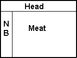 The trap is worse with frames. Look at the example on the left.
Suppose all of your pages have three frames, a heading at the top,
a navigation bar on the left ("NB"), and the meat of the page in
the lower right-hand 75%. Each page would consist of head.html,
navbar.html, and {meat}.html, where {meat} was map, minister,
welcome, FAQ, etc. Now suppose someone looks for your town,
denomination or minister in Google. Say that minister.html comes up.
Fine and good; there she is, great picture, warm welcoming words -
but, since your visitor is looking at minister.html, not the whole
three-framed page, and your navigation bar isn't there, he is trapped.
The trap is worse with frames. Look at the example on the left.
Suppose all of your pages have three frames, a heading at the top,
a navigation bar on the left ("NB"), and the meat of the page in
the lower right-hand 75%. Each page would consist of head.html,
navbar.html, and {meat}.html, where {meat} was map, minister,
welcome, FAQ, etc. Now suppose someone looks for your town,
denomination or minister in Google. Say that minister.html comes up.
Fine and good; there she is, great picture, warm welcoming words -
but, since your visitor is looking at minister.html, not the whole
three-framed page, and your navigation bar isn't there, he is trapped.
The first thing people will see when they search for you, even
before they get to your site, is your "Google Blurb" - the page's
description in the search engine results. Google uses the page's
title tag and a sentence or so showing the words the user searched
for. Other search engines use the "Description" meta tag. Make sure
yours are reasonable. Once your site is up and indexed (it takes
about two weeks), look for yourself in a couple of search engines.
Short Tips
Some other hints, in no specific order, before we get to the FAQ page:
Don't promise people a "warm, caring place to grow spiritually".
Church web sites use that phrase as often as used car dealers
promise the biggest selection at the lowest prices. The words
"dynamic", "diverse" and "vibrant" are over-used too.
Spell check and proof read. The two are not the same. A spell
checker will not always tell you if you use the "write" word in the
wrong context, even though it did pass the spell checker.
Typos make you look like a dufus. You can open an HTML file with "Word",
if your web editor doesn't have a spell checker. Have someone else proof
read, someone who is not as familiar with your work as you are. If you can't
find anyone, read your pages from the bottom up, one sentence at a time.
Put a year on all of your dates. It assures people your site is
current. If push comes to shove, it is better for people to see you
haven't updated your "Upcoming Events" page in two years than to
have them show up for an event that happened two years ago.
People expect a web page to have a light background and dark
text, just like the books, magazines and newspapers they read. They
expect text links to be blue and underlined. They don't expect any
other text to be blue or underlined. They expect visited links to
be purple. (800080, in raw HTML.) If you don't follow the standard,
you'll make people uncomfortable and look like a teenager doing
something stupid just for the sake of being different.
Look at 20 or 30 other church web sites from your town, your
denomination or both before you start. You shouldn't copy anything
without permission and credit, but you can certainly get some
general ideas.
Frames will annoy more people than they will help.
Make sure your title tag and description meta tag make sense if
someone reads them independent of the page itself. Many search
engines use them. Ours have our city and state ("Modesto, CA") in
every one.
Use pictures of happy people of all ages, colors and sizes doing
something interesting and smiling into the camera. Study after
study has shown this is the single best way to attract visitors.
A counter on every page will tell you how often people are
visiting your site, how they found you and which page they entered
first. If they found you via a search engine, it will also tell you
the argument they used. This may also dishearten you; I found that
65% of our visitors didn't want us at all. My church is in Modesto,
California. It has both a map page and a news page. Almost
two-thirds of our visitors are looking for either a map of Modesto
or news of Modesto. We try to be accommodating. I put a link to
MapQuest, with the parameters set to the center of Modesto, on our
Map page. I put a link to the Modesto Bee, Stanislaus County's
largest newspaper, on the News page.
The FAQ page
The FAQ page is for first-time visitors. A good FAQ page will
eliminate surprises.
The first thing most people will want to know is what to wear. A
first time visitor in a suit and tie is going to feel uncomfortable
before he even gets into the building if the other men have on
slacks and Aloha shirts. A lady in jeans will feel uncomfortable if
everyone else has on a silk dress and a hat. Knowing what to wear
is even more important for children. Their feelings are more
sensitive and their activities are more varied. Some churches have
children sit quietly and listen to their lessons, the boys in ties
and the girls in white lace dresses. Some have them do crafts with
messy stuff, or spend half an hour running around in the
playground. You don't want little Suzy to go home with grass stains
and library paste smeared all over her best Sunday dress.
You don't want to mandate a dress code, of course; a line like
"Most of our men wear a suit and tie, but you are welcome to come
in whatever makes you feel comfortable" will inform people without
dictating what to wear.
Someone in a wheelchair is going to feel VERY uncomfortable if
your building and restrooms aren't accessible. If he is in a
three-piece suit on Aloha Shirt Sunday, he is going to be
mortified. Accessibility should be your second Q on the FAQ list.
If you have someone who signs for the deaf, a hearing assistance
system, large-print hymnals or other aids for the handicapped, this
is a good place to mention them. We say we are wheelchair
accessible in three places - the main page, the map and directions
page and the FAQ page.
People are going to be apprehensive about their children. Tell them
if you provide childcare for the toddlers and separate services or
lessons for the older children. Tell them if their children can stay
with them (or are expected to stay with them) during the service. Tell
them if you have a crying room.
Our church's FAQ page assures visitors they won't be pressured to be
saved as soon as they step in the door. It also assures them we don't
paint ourselves blue and dance naked by the light of the moon. Your FAQ
page may not need those helpful tips. We Unitarian Universalists have
to combat a lot of rumors.
Other Pages or Sections to Consider:
A virtual tour, especially if you have something special;
the oldest church in the county, a building by a famous architect,
a cannon ball stuck in the bricks from the Civil War, a beautiful
sanctuary or garden you rent out for weddings. Someone in your
congregation with a digital camera should be willing to help here.
A History of your church, again especially if yours is special.
Sermons. Be warned; if you have complete sermons on your
site, someone may plagiarize them. If this will bother your
minister, don't put her sermons out there.
Links to
- Your district, state and national organization.
- Your nearest neighbors in your denomination. This is a courtesy to
someone in a town twenty miles away who finds you but really wants a
church nearer to home.
- Your town's chamber of Commerce or tourist board. (The UU
church in Amherst has a link to a virtual walking tour of
that pretty little New England town.)
- Your town's Inter-Faith council.
- Groups that use your building on a regular basis. They may want to
link to your Map page in turn.
It is easy to go overboard with links. Our church has a guideline; all
links have to be suggested by a committee and have some sort of
relevance to the church. We didn't want to compete with Yahoo.
Minister's Section, with her picture, a welcome statement
to prospective visitors and a longer biography.
Children's Programs; what they do, what they learn about,
how you take care of them.
Adult programs; social, religious, educational,
recreational.
News. Articles and pictures about sctivities and community service
projects. A picture of members serving meals to the homeless or hammering
away at a Habitat for Humanity site is worth a thousand words about caring.
Be careful; if you don't have any major news for more than a month or two,
either create some out of a minor activity ("Kids have fun in Sunday school")
or take the page down. It looks bad if "News" isn't up to date. Don't publish
the names of minors, and get permission from both the child AND the parent
before you publish a picture of a minor.
This isn't a complete list. Again, the best way to get ideas is to
look at 20 or 30 web sites in your town or your denomination. Look at a
couple of enormous congregations, a couple of small ones, and as many
as you can that are roughly your size.
Conclusions and Further Reading
That's about all I can tell you. You are probably getting tired of
sitting there anyway, and my 15 minutes are up. Feel free to write if
you have questions.
On the other hand, if you liked what you've read, here are links
to pages I mentioned in the top section, repeated for your convenience:
Why you need a Web Committee.
Usability Guidelines
I wrote this for the Back Country Horsemen of America, but the
advice is good for any local unit of a non-profit organization with
a volunteer web master - including a church.
This is a page in my site's section on
Web Design. The section has a page for:
Student Web Site suggestions
Church Web Site suggestions
HTML colors and Hexadecimal numbers
Usability
suggestions for any non-profit organization with a volunteer
web master.
You might also like the essay,
My Adventures as a UU Web Master,
a talk I gave to my church about being their web master.
Sections of my web site:
Home |
Christmas Letters |
Genealogy |
Homilies |
Misc. Essays |
Peace Corps |
Web Design
Problems, comments or complaints? Need an opinion? Send E-mail to:
This page updated: June 01, 2018